Aesthetics and a Preview
Aesthetic choices are important for the look and feel of a novel. Most novels don’t have illustrations or images in the traditional sense, but I believe choosing the right feel for each novel by using typography and backdrops for chapters is ideal.
The Orchestrylus Odyssey is a high fantasy series with some science fiction elements and cosmic horror elements. The target audience is obviously young adults, but I want people of all ages to enjoy the novels.
What sort of aesthetic might both adults and young adults be fine with?
The series has manga panels and flavor text throughout the series. While some adults don’t like anime or manga, I believe writing my novels this way is for the best. Most light novels are shorter, but I want my series to be known for being like a light novel series, yet still hefty.
I first released the series in 2023 as shorter novels, but I feel going forward having the books be between 80,000 and 150,000 words will suffice for my goals.
I’ve gone back and forth on this so many times, but I’m sticking to it now. Redo and retry until something works. I feel everything clicking now.
The typography is important. We must balance readability, white space, and legibility.
For me, I use 1.3 line spacing and 11-point font most times.
Auminous was different, packing a large amount of text on each page, because I wanted the book to feel more scientific and textbook adjacent due to Hermes Trismegistus’s quantum tuning science and the magic system of the novel. Tuning was more of a science than pure magic, despite it being supernatural in application.
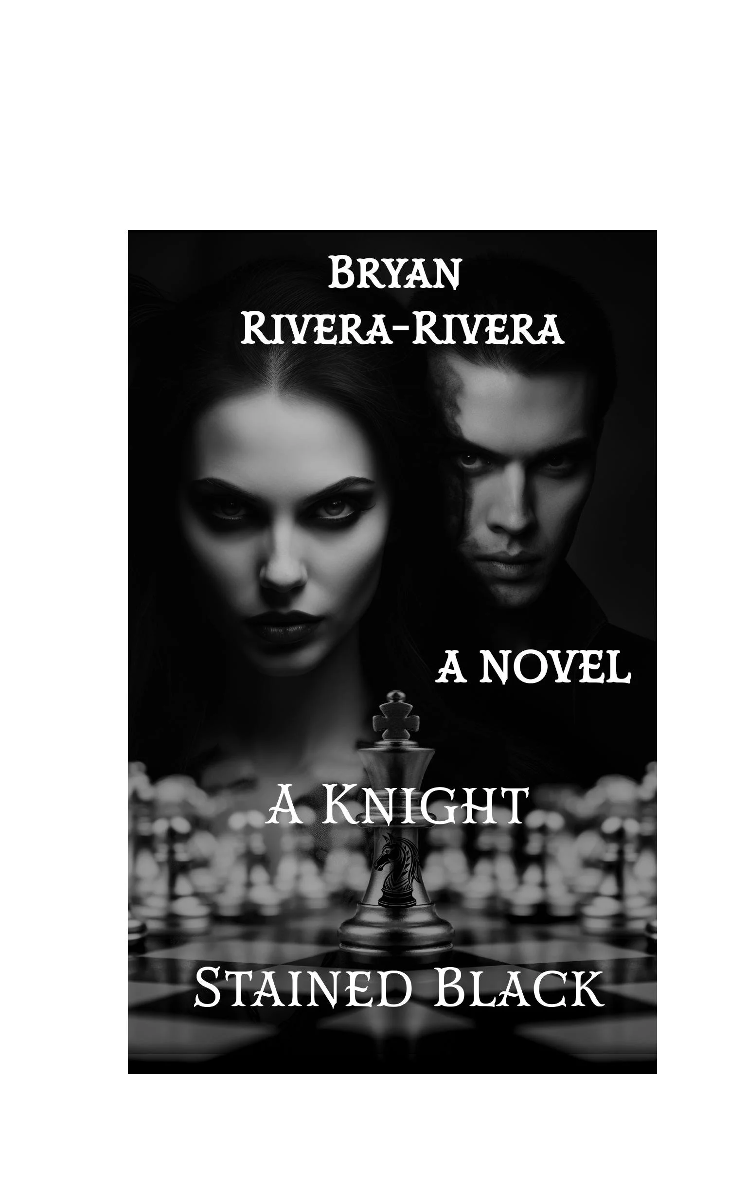
A Knight Stained Black is standard fare, but it has a chess aesthetic and Polish folklore flair to it, so the chapter images alternate between chess images and a striking balance between intricate patterns and the natural world. I delayed the book for the last time to get the themes and structure corrected, as well as ensuring the aesthetic translates well to both print and eBook formats. Authors like Sarah J. Maas now do a book every two years, and Rothfuss and Martin are years in the making, so I don’t feel so awful doing some delay. It’s better to release a novel you feel is right and where it should be, despite not having the books be perfect, as that’s not a thing that can be done in this universe.
Aesthetic is important for the “feel” of a book.
I want A Knight Stained Black to resonate with a gothic, dystopian, yet folklore aesthetic.
The Orchestrylus Odyssey has a whimsical and anime aesthetic to it, and I’m getting better at paneling as I go.
These aesthetic choices force me to slow down on the artistic side of things, but writing can be as fast or slow as I want it to be.
Choose the right look and feel for your novels. I like it when books have a certain aesthetic to them, whether that’s typography, illustrations, or accents.
But your book is your baby, so do what you feel is best.
Ultimately, if you’re happy with the work, the readers should feel that passion and reciprocity will follow.
Until next time, happy writing!
Here’s a preview of A Knight Stained Black which releases at the end of this month!